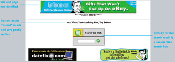
Web Bloopers: 60 Common Web Design Mistakes and How to Avoid Them

Introduction

The dot-com crash of 1999 2000 was a wake-up call. It told us the Web has far to go before achieving the level of acceptance predicted for it in 1995. A large part of what is missing is quality. A primary component of the missing quality is usability. The Web is not nearly as easy to use as it needs to be for the average person to rely on it for everyday information, communication, commerce, and entertainment.

A Few Choice Bloopers

As an example of poor quality and low usability, look at a Search results page from WebAdTech.com, an e-commerce site (Figure I.1). The results are for a search that found nothing. The page has several serious problems:

  • Where am I? Neither the site we are in nor the page we are on is identified.

  • Where are my Search results? The page is so full of ads, it is hard to spot the actual search results.

  • Huh? The message shown for null search results is written in such abysmal English (not to mention inappropriate capitalization), it is hard to understand.

  • What now? The remedy offered for not finding anything is a box for searching the entire Web.


Figure I.1: www.WebAdTech.com (Dec. 2000)-No page identification; poorly written error message hard to spot amid ads; unhelpful website search box.

Not surprisingly, WebAdTech was one of the casualties of the dot-com crash; it is gone. However, many sites with significant usability problems remain.

For example, searching for...

UNLIMITED FREE
ACCESS
TO THE WORLD'S BEST IDEAS

SUBMIT
Already a GlobalSpec user? Log in.

This is embarrasing...

An error occurred while processing the form. Please try again in a few minutes.

Customize Your GlobalSpec Experience

Category: Website Development and Optimization Services
Finish!
Privacy Policy

This is embarrasing...

An error occurred while processing the form. Please try again in a few minutes.