GUI Bloopers: Don'ts and Do's for Software Developers and Web Designers

This book cuts right to the core of the most common interface problems, offering real-world advice to the computer software programmer.
The final category of interaction bloopers is concerned with common errors involving dialog boxes.
Sometimes GUI developers are so focused on the design of particular windows in a software application (or pages in a Web site) that they don't step back to look at the larger picture. How many windows (or Web pages) are there, and how easy is it for users to find their way around in them? As a result, many software products and services have far too many windows or pages, or window/page hierarchies in which users get lost easily. "Where am I? How did I get
here? How do I get back to where I was? Where the heck is that Line Width setting? What was I doing before the phone rang?"
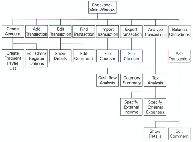
When I review a software product or a Web site for a client, I usually construct a representation of the software's entire window or Web page structure. Creating this representation lets me see the "big picture." My preference is to represent the structure as a graph (see Figure 5.28,)but some of the software I've reviewed has had so many windows or pages that a graph would have been impractical because it would have covered an entire wall or it would have been such a tangled mess of boxes and lines that it would not have been helpful. In such cases, I use an outline instead of a graph (see...