Usability for the Web: Designing Web Sites That Work
A simple, time-efficient way to design, develop and improve your web sites.
As an example of usability inspection, we present a quick inspection of www.whitehouse.gov (see Figure A-1). The screen shots will help you understand some of the comments, but an analysis really requires that you navigate the site. (Keep in mind that this site is bound to change over time.) This example reviews how some basic guidelines apply to the site, but a full report would also need to prioritize problems and recommend solutions. You may not agree with how each problem is categorized, but many problems fall into multiple categories (e.g., a problem with inconsistent navigation is a problem both for consistency and navigation), and the point is that each category of guidelines gives you an opportunity to spot a problem. You also may not agree with every criticism. Only multiple reviewers would resolve which concerns are important enough to merit fixing, and issues that remain debatable are good issues to address in user testing.
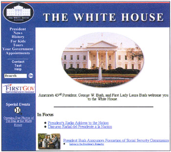
The basic information you'd expect to find is there: about the president, White House news and history, contact information, and basic government information.
Lengthy text is not always chunked well. For instance, Past First Families within History appears as a long article on multiple pages without paragraph headings and with each page labeled "Page 1," "Page 2," "Page 3," and so on, rather than having meaningful page names (such as chronological dates). (In addition, rather than using "You are here"...