Excel for Scientists & Engineers

For scientists and engineers tired of trying to learn Excel with examples from accounting, this self-paced tutorial is loaded with informative samples from the world of science and engineering.
 TABLE OF CONTENTS
 Science calls them Graphs. Business calls them Charts, so Excel calls them Charts, too. But they are basically the same thing.
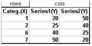
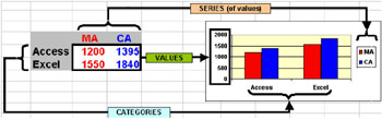
Charts are based on tables with categories (usually in the rows) and series of values (usually in the columns; see Figure - 36). They typically display the categories on the horizontal axis (X-axis) and the values on the vertical axis (Y-axis).
If you were to display the data in the table shown in Figure - 36 in a graph like that shown in Figure - 37, the first table column would be considered categories, and not X-values.
Basically, there are four different types of graphs:
Pie charts display only one series of values; for other series, you need another pie (or one set of concentric "donuts"). Combined, all of the values in this one series of values make up 100% of the pie.
Column and Bar charts can hold many series of values. The labels of those series are shown in the legend. The horizontal axis displays categories (even if they are values - so 1 would actually be "1 ").
Line charts are very similar to the previous group. Again, the horizontal axis holds categories (names or labels) but never...