Excel for Scientists & Engineers
For scientists and engineers tired of trying to learn Excel with examples from accounting, this self-paced tutorial is loaded with informative samples from the world of science and engineering.
 TABLE OF CONTENTS
 Regression Analysis can be done either mathematically or graphically:
Graphically with XY charts
Mathematically with functions such as SLOPE, INTERCEPT, RSQ, and TREND
Mono-factorial linear regression assumes a linear relationship between two factors: a dependent factor Y and an independent factor X. You yourself decide which one of the two you want to declare the dependent factor, which you then derive from the independent factor by using a linear equation.
The least squares method finds the prediction line
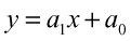
that minimizes the value of

by using the following steps:
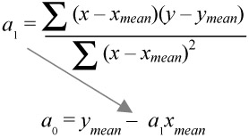
In a mathematical approach, this relationship can be described by the following linear equation:
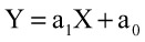
where a 1 is called the slope and a 0 is called the intercept.
This equation, which allows you to calculate Y (dependent) based on X (independent), is based on the least squares method (Figure - 61).
In a graphical approach, you can add regression lines (Excel calls them trend lines) to each series of values in the XY graph - including the above equations.
The measured values are actually scattered around the regression line. The "measure of scatter" is also called R-squared value (RSQ). The closer this value comes to 1, the more accurate the prediction.

How can you add regression (or trend) lines like those in Figure - 62?
R-Click on a specific series of values.