Mass Finishing Handbook

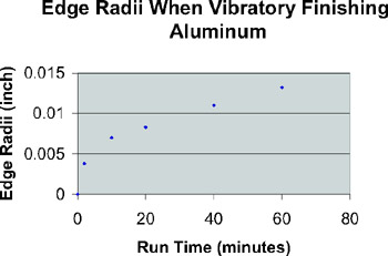
Charting experimental data illustrates how deburring and other surface finishing features look with respect to time or other variables. Such relationships are not apparent in data sets as they might appear in tables, and information that is not charted is forgotten over time. Hence, charts of variables for different finishing processes are useful to anyone gathering data and will help others (customers, media suppliers, engineers, supervisors) understand the relationships of variables in mass finishing processes. From such charts, users can easily read off expected values at different run times and thus make good decisions about the examined process in years ahead.
Microsoft Excel makes charting any data simple. In less than five minutes this program can make a chart of any deburring or surface finishing data (like that of Fig. A-1). The details for using Excel in this capacity are straightforward and explained in many books. To see how to make charts using Excel , go to Help in the program's toolbar, enter Chart and scroll down until Create a chart is found. A brief description will appear on chart making. It is truly simple to do.
Although we give an overview of this process in this appendix, our main purpose is to offer an explanation of the mathematics behind how Excel creates a best-fit line of data. The mathematical basis for the best-fit model is...