Excel 2007 for Scientists and Engineers

With examples from the world of science and engineering, this reference shows scientists the tips and techniques of Excel and how to tailor them specifically to their experiments, designs, and research.
Excel offers a good array of graph types, all of which fall into four main types: Pie, Column, Line, and XY. All the other types are essentially subtypes of these four. What are the differences between the various graph types, and when should you use which type?
Figure 3.1 explains a bit of the terminology related to tables and their graphs:
This table has four categories; they end up on the horizontal axis.
This table has two series of values; they determine the number of columns for each category.
The values of the data series are on the vertical axis, if the graph does have axes.
The labels of the data series end up in the legend.
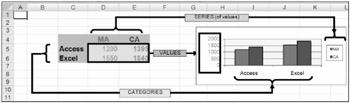
Figure 3.2 shows the four main graph types Excel has to offer:
Pie (and Doughnut)
Column (and Bar)
Line (plus Area and Surface)
XY (or Scatter)
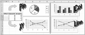
Here is an overview of the main characteristics of each major graph type:
Pie and Doughnut graphs: These graphs have no axes. A Pie graph is based on a category and is limited to only one data series; a Doughnut graph...